The healthcare billing space was full of products built to help practices manage billing better.
Faster claims, cleaner reconciliation, more efficient revenue cycle tools. All of it optimized for the provider side, which OODA knew wasn't the right thread to pull.
One hospital stay could generate bills from four different sources, arriving months apart, none reflecting what insurance had actually paid yet. Patients were paying balances that weren’t final, with no way to know the difference.
Except the payer did. The insurance companies were the only players with the complete picture of what was performed, what the plan covered, and what the patient owed.
So instead of OODA adding another voice to the noise, we’d operate on behalf of the payer. It was a radical departure from what patients expected from their insurance company.
Which is exactly why the first version of OODAPay wasn’t a dashboard.
It was a letter.
Because I was designing on behalf of the payer, I could consolidate everything.
All that chaos — multiple provider charges, scattered claims, cryptic line items — into a single, unified statement written in plain language. A named patient services consultant, a phone number, a human being to call if something didn’t make sense.
The paper-first rollout was intentional. The people using this product were older, lower-income, dealing with real health concerns, not early adopters looking for a new app.
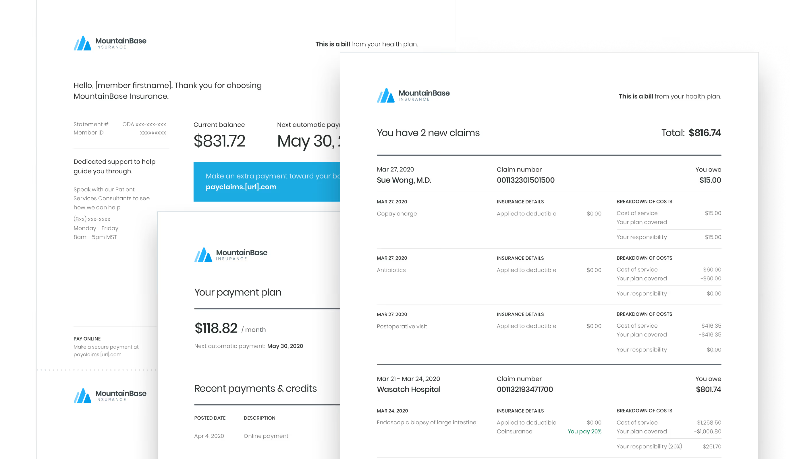
Meeting them there wasn’t a compromise, it was the only honest starting point. And the hypothesis was that if we could get them comfortable with the concept first — one bill, from their payer — the digital product would follow naturally. Paper was costly, but the adoption it would earn was worth it.
Once the concept of paying the insurance company a bill that wasn’t your premium, I moved into a digital experience.
This included tactical pieces like statements via email, an educational microsite, and a guest payment portal. But I ran into a constraint I couldn’t design around: HIPAA.
I couldn’t talk directly to patients or recruit them for research sessions. The data I needed was in conversations I wasn’t allowed to have.

What I had instead was a customer success team taking live calls from members every day.
I worked closely with them to build brief questionnaires they could weave into their regular calls — nothing clinical or intrusive, just a few questions embedded in conversations that were already happening.
It was a proxy, but the signals that came back were specific enough to act on.
OODAPay had two experiences: a guest path patients could use without creating an account, and an authenticated one they could log into.
72% never bothered logging in. 80% were asking about family accounts that didn’t exist yet. More than half wanted to pay with their HSA and had no path to do it.
Closing those gaps meant working across engineering, ops, and legal to understand what was actually achievable. Family accounts required HIPAA-compliant mechanisms to securely link dependents.
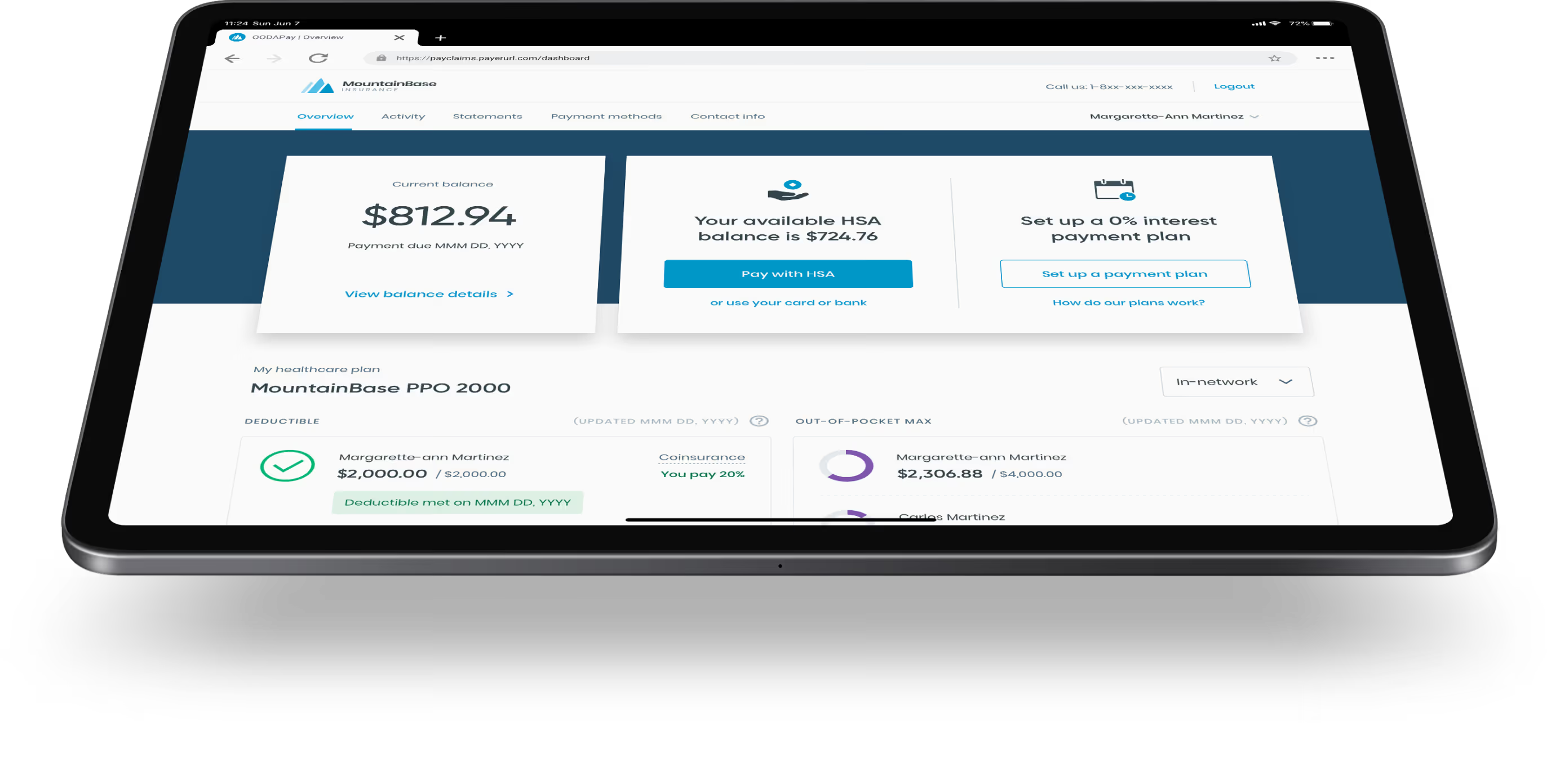
HSA support introduced a different layer — financial data carries its own disclosure requirements separate from health data, and what could be surfaced and how it had to be designed around those constraints.
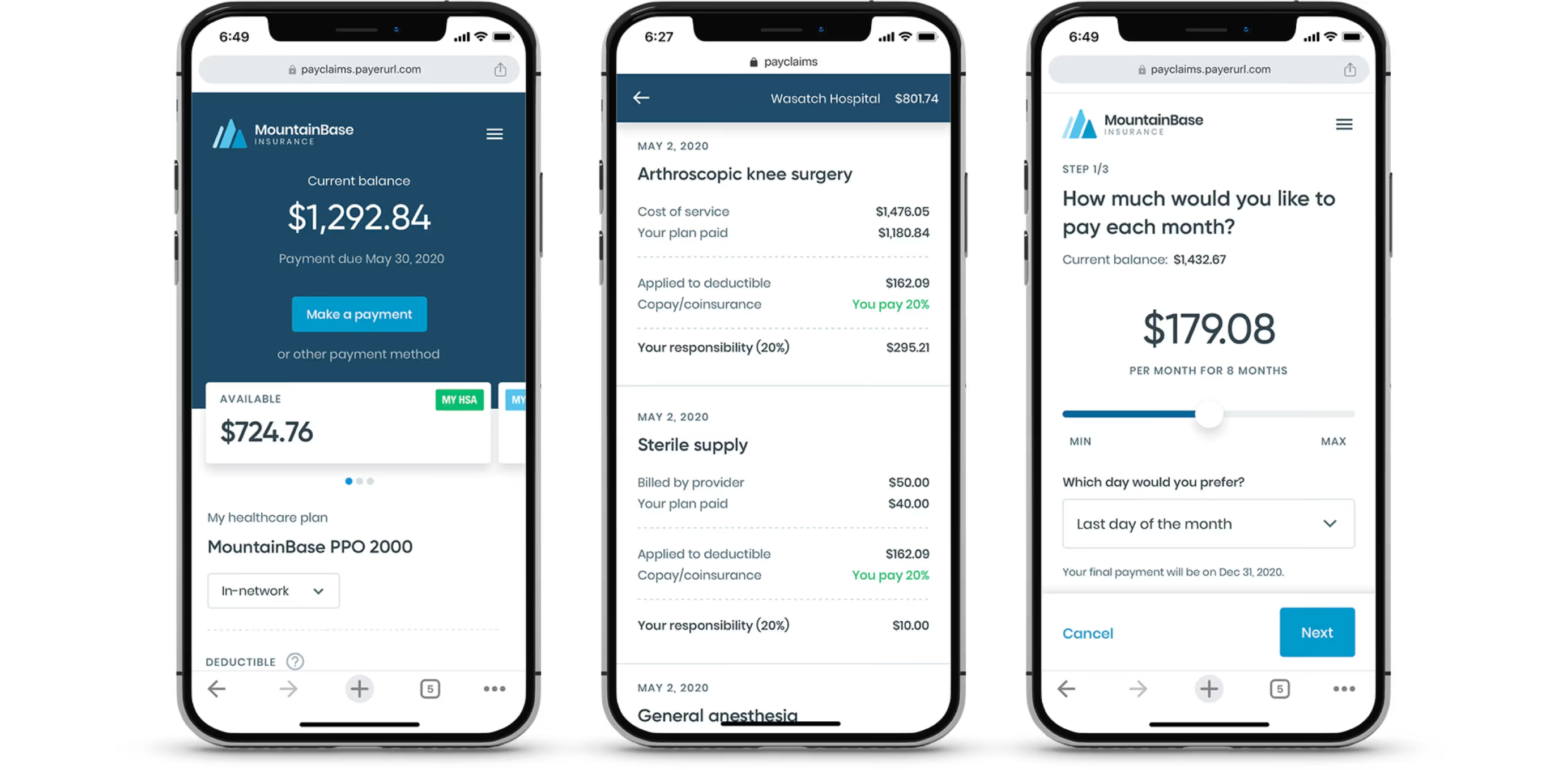
When both shipped, authenticated logins went up 25%. The login experience hadn’t changed. The reason to log in finally had.
The mobile experience was the last piece. Nobody sits down to plan when they’re paying a medical bill — they tap the link from their email while they’re doing something else. The interface needed to work for that moment.
Early NPS benchmarks showed patient billing satisfaction with OODAPay at 93% positive.

And that’s against a healthcare industry which averaged around 40% at the time, so we and our pilot partners, Blue Shield of California and BCBS of Arizona, were pretty satisfied with that.
In May 2021, Cedar acquired OODA Health. The acquisition was driven in meaningful part by OODAPay, which was renamed Cedar Pay and is still in production today.
I think about that sometimes. Somewhere right now, someone is having a procedure and in a few weeks they're going to get a bill. And likely because of this work, it'll come from a name they recognize, show a number they can trust, and give them one clear way to pay it. That's no small thing and reminds me why we do this.