Two founders, one market, and a week to figure out where to start.

The Dominguez sisters didn’t come to me with a feature list. They came with a mission: give beauty professionals the tools to build careers on their own terms. April had the business instincts.

Nikki had spent years as a working stylist, with relationships across the industry and a firsthand understanding of how broken the hiring process was. Together they had something most early-stage founders don’t — a founding team that actually understood the people they wanted to build for.
role
lead designer
engagement
~3 months
challenge
Designing for fit
outcome
4.5+ app store rating
01
the starting point
02
the sprint
03
for both sides
04
the after
05
stays with me
01
Finding the starting point

The market gap they’d identified was genuine. Beauty professionals simply weren’t on LinkedIn.

They were posting on Craigslist, going door-to-door with a resume, or relying on word of mouth from whoever they happened to know. Salons, on the other side, were trying to hire for something almost impossible to quantify — fit.

Not just technical skill, but aesthetic, personality, vibe. The existing tools couldn’t get anywhere near that.

The hypothesis was that stylist recruiting was the highest-impact place to start.

The hypothesis April and Nikki brought in was that stylist recruiting was the highest-impact place to start. My job was to validate that hypothesis, or pivot from it.

We ran a full week design sprint.

02
the sprint

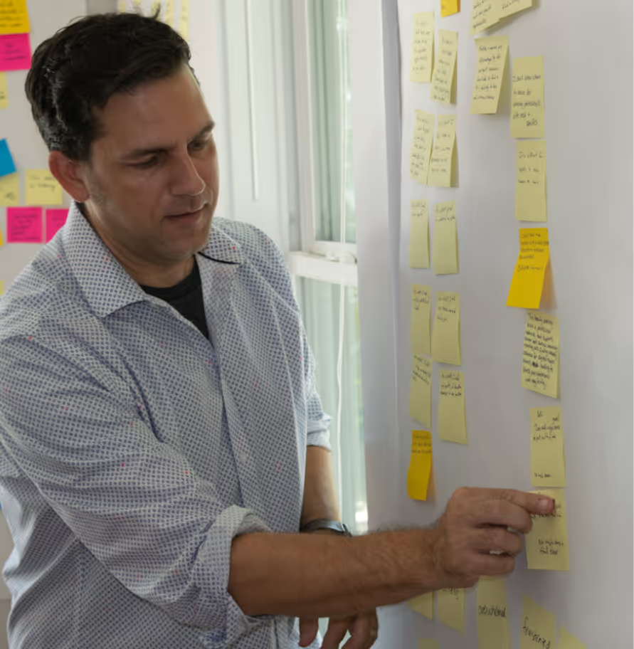
The first two days were research. We met with salon owners and stylists in Austin, mapped their journeys, and filled a wall with stickies.

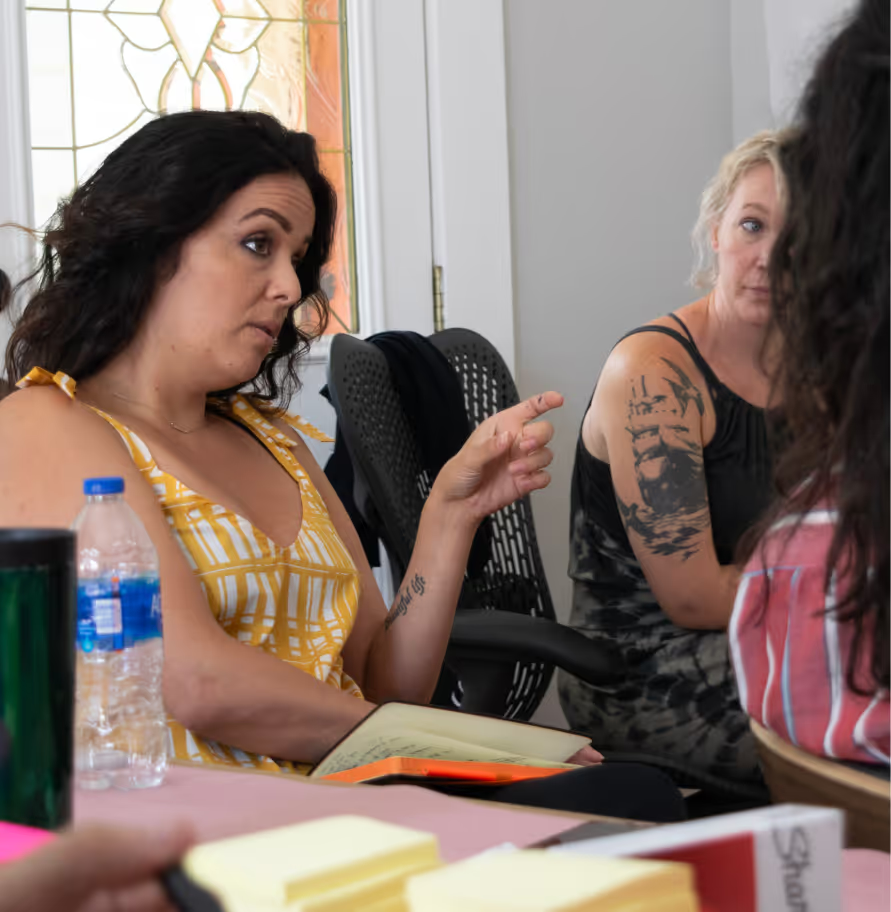
Nikki wasn’t just present for those sessions — she was essential to them. Her credibility opened doors that a cold research team couldn’t. People talked to her differently. More honestly.

What came back confirmed the hypothesis. The hiring funnel was broken for both sides, and both sides were willing to engage with something better.

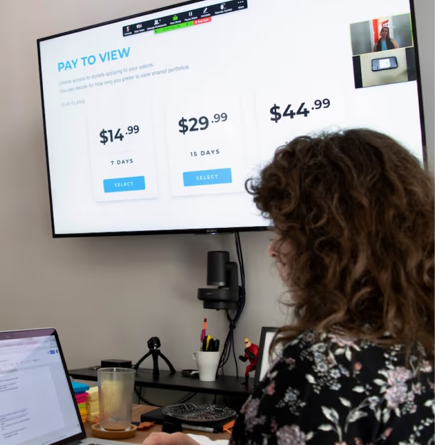
We tested pricing models too — specifically whether salon owners would pay for access when stylists would not. They would. That wasn’t a small finding. It de-risked a core business assumption before a single screen was designed.

Man in patterned shirt pointing at sticky notes arranged on a whiteboard near a window.Woman in yellow dress speaking to a group while holding a notebook in a meeting room.Person in floral shirt attending online meeting with pay-to-view pricing plans displayed on wall screen.

The sprint also surfaced ideas that weren’t the starting point. Nikki had a strong pull toward an education component — content to help stylists improve their craft. A real need, but not where we needed to start.

I leaned into the data: education hadn’t surfaced as a primary pain point, and the monetization path was murkier than the job board model. She came around, and we parked it with the explicit agreement it came back once we had footing in Austin.

That conversation set the tone for everything that followed. They knew when to push and when to trust the process.

03
Designing for two sides

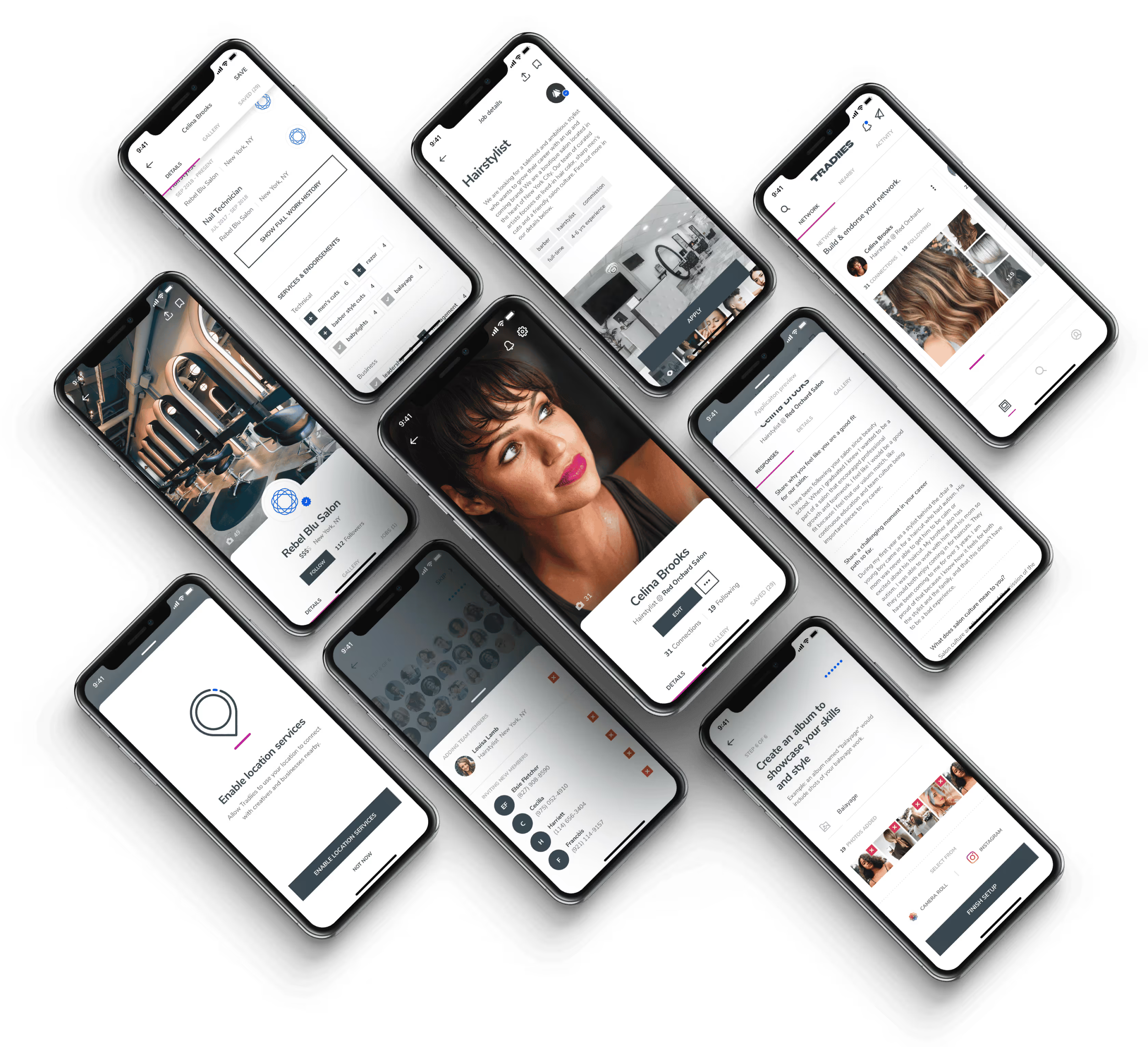
The product was a dual marketplace, which meant every decision had to work for two users with different needs and different stakes.

For stylists, the challenge was self-expression — how do you help someone communicate their aesthetic and personality in a meaningful format for a salon owner?

For salon owners, it was the reverse: making an almost entirely intuitive sense of “fit” legible enough to act on.

One deliberate choice was not charging stylists. That wasn’t just a pricing call. It was a signal about whose side the product was on — and for a community that had been operating on Craigslist and shoe leather, it mattered.

Nine smartphones displaying app screens related to salon profiles, hairstylist details, network, and location services.

I set the design criteria around three things: empowerment, efficiency, and trust — not as abstract values, but as a check against every flow.

I mapped user objectives to flows before touching visual design, tested in wireframes before going high fidelity, and built a design system deliberately sized for handoff. Foundational components, nothing precious, everything documented.

04
What happened after

The engagement had a defined end point, and when it reached it, we handed the project to another Austin agency to carry forward.

We did that as it was right around when Mighty closed its doors. The product launched to the App Store in Q1 2019. It held a 4.5+ rating for most of its life.

The education component Nikki had advocated for during the sprint shipped after they’d established themselves in Austin and New York. So did peer recognition tools, a Q&A forum, direct messaging. Most of what went into the parking lot eventually made it into the product — just in an intentional order.

The product launched to the App Store in Q1 2019 and confidently held a 4.5+ rating through the end.

Their business closed in 2024, but I don’t think that changes what the work was. The market need was real, the product reached the people it was built for, and it kept earning their trust for years. Some things just have a natural run.

05
What stays with me

What I think about when I think about this project isn't the sprint or the design system.

It's that April and Nikki knew exactly who they were building for. That kind of clarity makes everything downstream easier — it gives you something to design toward when the decisions get hard.

jp signature